
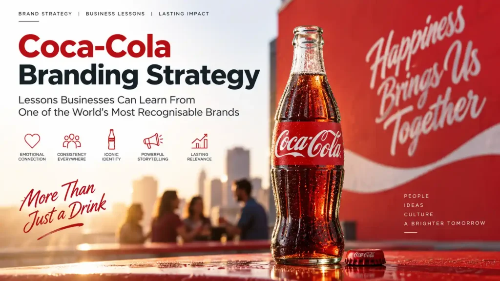
Coca-Cola is one of those brands that needs no introduction. Show the red logo to almost anyone on the planet and they will know what it is, even without reading a word. That kind of recognition does not happen by accident, and it comes from decades of deliberate branding work.
Coca-Cola’s success was never just about the drink itself. Plenty of cola brands taste similar. What sets the Coca-Cola branding strategy apart is everything built around the product. It includes identity, consistency, emotional pull, storytelling, packaging, and steady change without losing itself.
What Is Coca-Cola’s Branding Strategy?
Coca-Cola’s branding strategy uses a clear visual identity and strict consistency across every touchpoint.
It also focuses on emotional branding around happiness and togetherness, not the product itself. It combines a clear logo, colour, and bottle shape with storytelling that makes the soft drink a shared experience.
This article breaks down what makes it work, and pulls out practical lessons any business can use.
What Makes Coca-Cola’s Branding Strategy So Successful?
At its core, the Coca-Cola branding strategy relies on a few key pillars. These work together. They include a unique brand identity, strong consistency, and an emotional bond with people. None of these does the heavy lifting alone.
A Distinctive Brand Identity
The logo, the signature red, the flowing script, the contour bottle, and the ribbon device work as a set. Even one element alone can signal Coca-Cola.
Consistency Across Brand Touchpoints
The look and feel stays the same everywhere. It works on a supermarket shelf, a billboard, or a vending machine. It stays consistent across packaging, ads, social media, retail, and digital channels.
Strong Emotional Positioning
Coca-Cola rarely talks about the drink itself. Emotional branding focuses on happiness, togetherness, celebration, and shared moments.
It does the heavy lifting, so the brand feels bigger than the product.
Coca-Cola’s Brand Identity: More Than Just a Logo
It is tempting to think Coca-Cola’s brand identity begins and ends with a logo.
But its identity includes several distinct assets.
Each asset is recognisable on its own.
The Coca-Cola Logo
The logo has barely changed since it first appeared in Atlanta newspaper ads in 1887.
The script trademark was registered on 31 January 1893.
This is according to The Coca-Cola Company’s trademark chronology. Over more than a century, the changes have been small refinements, not overhauls. That is why the logo triggers instant recall, no matter where someone sees it.
Coca-Cola’s Signature Red Colour
The red is now part of the brand, linked to energy and warmth. Coca-Cola never lets that colour slip. Every can, cooler, and ad keeps the shade consistent.
The Contour Bottle and Packaging
The curvy glass bottle was designed to be recognised even in the dark or by touch.
The Root Glass Company patented it on 16 November 1915.
This is documented in The Coca-Cola Company’s own account of the contour bottle’s history. It later became so iconic that the company trademarked the shape in 1961. This happened after the patent expired. It showed how one visual asset can carry an entire brand.
Typography and Visual Elements
The Spencerian script gives the wordmark its personality, while the Dynamic Ribbon adds motion underneath it. Together with the red and bottle shape, these form a visual branding system holding together no matter the format.
Expert insight: Coca-Cola stays recognisable because it treats colour, typography, and packaging as long-term investments. It does not treat them as campaign-only choices. That is what separates a logo from a true brand system.
The Power of Consistency in Coca-Cola’s Branding
Consistency is probably the most underrated ingredient in this strategy. The colours, typography, and tone of the message stay the same over decades. The advertising style always feels like the same family, online and offline.
Why Brand Consistency Matters for Businesses
This scales down easily to smaller businesses. A strong brand should be recognisable before a customer reads the company name. Repetition builds recognition, and it only works if the thing repeated stays the same.
How Coca-Cola Uses Emotional Branding to Connect With Consumers
This might be the most important part of the whole strategy, and the one businesses underestimate most.
Selling an Experience, Not Just a Product
Coca-Cola ads rarely focus on taste or ingredients. Instead, they focus on happiness, friendship, family, celebration, and togetherness. A holiday commercial usually shows people gathering and connecting, not the drink.
The Role of Brand Storytelling in Coca-Cola’s Marketing
Brand storytelling is what turns a can of soda into an emotional trigger. In 2021, Coca-Cola introduced Real Magic. It was its first new global brand platform since 2016. The company said it focuses on unexpected moments of human connection.
Its Share a Coke campaign, launched in Australia in 2011, relaunched globally in 2025 across 120-plus countries on the same idea, per Coca-Cola’s media centre. A story people see themselves in turns a product into a memory.
What Businesses Can Learn From Emotional Branding
A bakery does not need to sell “bread”; it can sell the comfort of a family breakfast. A fitness studio does not need to sell “workouts”; it can sell confidence and community. The product stays the same, but brand storytelling changes how customers feel about buying it.
Coca-Cola’s Global Branding Strategy: Consistency With Local Relevance
Coca-Cola operates in over 200 countries, yet the brand feels remarkably unified everywhere, a balance not easy to pull off.
Maintaining a Global Brand Identity
The logo, colour, and overall tone stay untouched no matter which country the product is sold in, making the brand feel trustworthy even to first-time travellers.
Adapting Campaigns for Local Audiences
At the same time, Coca-Cola tweaks messaging, festivals, and flavours to match local culture. Share a Coke, for instance, is localised name by name across its 120-plus markets rather than simply translated.
Why Localisation Matters for Growing Brands
Expanding businesses often trip up here, either localising so much the brand loses its identity, or refusing to localise and feeling out of touch. Businesses growing into new regions, including local markets in Kerala, need that same balance.
Coca-Cola’s Brand Evolution: How to Rebrand Without Losing Recognition
Even a brand as strong as Coca-Cola has had to change over time, and the difference is how carefully those changes get handled. The 2021 Real Magic platform is a good example: Coca-Cola updated its visual identity and introduced a new “Hug” logo treatment but never touched the wordmark, the red, or the bottle shape already trademarked for decades, protecting existing brand equity instead of throwing it away.
Evolution vs. Complete Rebranding
Brand evolution refines an existing identity while keeping recognisable elements intact. Rebranding makes substantial changes to identity, positioning, or direction. Coca-Cola almost always chooses the first path, and Interbrand’s 2025 Best Global Brands report still ranks it seventh most valuable worldwide, worth an estimated $60.1 billion, per Interbrand’s ranking.
What Coca-Cola’s Evolution Teaches Businesses
Evolve when necessary, but do not throw away equity already built. A business that changes its look every couple of years starts from zero each time; one that refines gradually keeps building on what came before.
7 Branding Lessons Businesses Can Learn From Coca-Cola
1. Build a Distinctive Brand Identity
Every business needs visual assets recognisable on sight, not a logo sitting in isolation. Colours, shapes, and fonts should work together as one system.
2. Stay Consistent Across Every Touchpoint
Website, social media, packaging, ads, signage, and even staff uniforms should all feel like they belong to the same brand.
3. Create an Emotional Connection
Move past listing features and communicate what the brand actually means to the people buying from it. That is emotional branding in practice, not just theory.
4. Make Your Brand Instantly Recognisable
Distinctive colours, typography, imagery, design elements, and tone of voice add up to instant recall, but only if used the same way every time.
5. Tell Stories Instead of Only Selling Products
Brand storytelling creates associations that stick around long after a purchase, and is remembered far longer than a list of product specifications.
6. Adapt Without Losing Your Core Identity
This matters especially for businesses expanding into new markets. Local relevance should never come at the cost of brand recognition.
7. Treat Branding as a Long-Term Investment
Strong brands are not built through one campaign or one logo redesign, but through years of consistent decisions.
How Kerala Businesses Can Apply Coca-Cola’s Branding Lessons
These principles are not limited to global giants. Businesses across Kerala can use the same approach at their own scale.
This includes startups, restaurants, D2C brands, healthcare providers, real estate firms, and education or hospitality businesses.
Build a Strong Visual Identity
Pick colours, fonts, and design elements that reflect the brand’s personality, and stick with them across every platform.
Develop a Consistent Brand Voice
Whether the content is a WhatsApp message or an Instagram caption, the tone should feel like it comes from the same source.
Create a Clear Brand Positioning
Customers should be able to answer “what does this brand stand for” without much hesitation. If they cannot, the positioning needs work.
Maintain Consistency Across Digital and Offline Channels
A shop’s signage, packaging, and social media presence should feel connected, not like three different businesses.
Getting this right takes time. That is where a branding agency in Kerala can help. It shapes your visual identity, tone of voice, and positioning. It also keeps everything consistent across every channel.
When Should a Business Consider Rebranding?
Rebranding is a big decision. A few signs point toward the need for one:
- Visual identity feels outdated compared to competitors
- Business positioning has genuinely changed
- The target audience has shifted
- The brand is hard to differentiate in its category
- Visual communication across channels has grown inconsistent
- Expansion into markets the old identity does not fit
- A negative or outdated brand perception needs resetting
Rebranding vs. Brand Refresh
People often use these terms interchangeably, but they mean different things.
| Brand Refresh | Rebranding |
| Minor visual updates | Major identity changes |
| Retains core identity | May redefine brand identity |
| Updates design elements | Can change positioning entirely |
| Suitable for modernisation | Suitable for strategic transformation |
Most businesses only need a refresh. Full rebranding is a bigger, riskier move reserved for genuine strategic shifts.
How a Professional Branding Agency Can Help
Building a brand like this from scratch, or fixing one that has drifted, needs more than internal effort. Choosing the right branding agency can help businesses align their positioning, visual identity, messaging, and long-term brand strategy. A professional branding agency provides clear support for strategy, positioning, naming, and logo design.
It also helps with visual identity, brand guidelines, packaging, and marketing communication.
It supports out-of-home branding and keeps your digital presence consistent.
This matters most when scaling, entering new markets, or struggling to sound consistent across channels. Quadcubes is a branding agency in Kerala. It helps businesses solve these challenges. It builds strong identities that last, like Coca-Cola’s for over a century.
Frequently Asked Questions About Coca-Cola’s Branding Strategy
What is Coca-Cola’s branding strategy?
– Build a clear brand identity.
– Stay consistent across every channel.
– Use emotional branding that focuses on happiness and togetherness.
– Don’t focus on the product.
Why is Coca-Cola’s brand identity so successful?
It combines recognisable assets like the logo, red colour, bottle shape, and script into one branding system.
That system has barely changed in over a century.
What makes Coca-Cola’s logo recognisable?
Its Spencerian script has remained largely unchanged since the 1880s, and the company has legally protected the trademark since 1893.
How does Coca-Cola use emotional branding?
By linking the product to feelings like happiness, family, and celebration. This is backed by brand stories in campaigns like Real Magic and Share a Coke.
What can small businesses learn from Coca-Cola’s branding strategy?
That consistency, emotional connection, and long-term thinking matter more than a big budget.
Why is brand consistency important?
Repetition builds recognition, and recognition only works if a brand looks and sounds the same every time.
When should a business consider rebranding?
When positioning, audience, or market conditions have genuinely shifted, not simply because the look feels a little old.
What is the difference between brand identity and brand strategy?
Brand identity is the visual and verbal expression of a brand: logos, colours, tone. Brand strategy is the plan behind what it stands for and how it is positioned.
Did Coca-Cola rebrand in 2026?
Coca-Cola introduced a refreshed global visual identity in July 2026. Instead of replacing its core identity, the company strengthened established assets including its red-and-white palette, Dynamic Ribbon, Arden Square, and Spencerian script.
Lesson Learned From Coca-Cola’s Branding Strategy
Coca-Cola’s success was never about one logo, one colour, or one clever campaign. This branding strategy has stayed consistent for over 100 years, while still evolving. It grew from the 1915 contour bottle to the 2021 Real Magic platform. Today, it remains one of the world’s most valuable brands.
Any business can use this playbook. Start by reviewing your current positioning, visual identity, and customer perception. Then work with an experienced branding agency in Kerala. Use those insights to build a real long-term strategy.